Thank you! Your submission has been received!
Oops! Something went wrong while submitting the form.
One of the weirdest things happening in packaging right now is that almost everybody has decent design. Ten years ago, if you had strong packaging, you immediately stood out. Now everybody has access to inspiration, mockups, AI image generation, templates, Canva, cheap freelancers, and endless references online. The barrier to entry is insanely low, which means most packaging today lands somewhere in the “pretty good” category.
And honestly, that’s exactly why so much of it gets ignored.
The biggest mistake brands make right now is thinking packaging just needs to look cool. That mindset usually leads to trend-chasing, overdesigned labels, safe aesthetics, or packaging that looks nice in a mockup but completely disappears once it hits a shelf next to twenty competitors trying to do the exact same thing. We see it constantly in cannabis especially. Everybody starts pulling from the same visual references until entire shelves start blending together. Minimal packaging. Fake luxury packaging. Overstuffed AI-generated art. Loud psychedelic visuals with no actual direction behind them. Everything starts feeling weirdly familiar. And the problem is, customers can feel that. People don’t remember packaging because it was technically well-designed. They remember packaging because it made them feel something. It caught their attention. It felt different. It felt authentic to the brand behind it.
Boring is bad for business.
That doesn’t mean every package needs to scream at people or feel chaotic for the sake of it. Some of the best packaging systems are actually pretty restrained. The difference is that they feel intentional. They know exactly what they are and who they’re talking to. That’s where a lot of brands get stuck. They start designing for trends instead of designing for recognition.
A lot of brands approach packaging like it’s just art wrapped around a container. But honestly, good packaging has way more to do with systems thinking and marketing psychology than most people realize. When we work on packaging, we’re not just thinking about how the front panel looks. We’re thinking about how it sits on a shelf, what gets covered up in a cooler, how recognizable it is from ten feet away, how the colors work together across an entire SKU line, how it photographs online, and whether it still feels recognizable once the product line expands six months later.
That bigger-picture thinking is usually the difference between packaging that feels “cool” and packaging that actually builds a memorable brand. A lot of packaging today feels designed one product at a time instead of as part of a larger ecosystem. Someone makes one cool bag or one cool can, then the next SKU follows an entirely different trend, then another one looks unrelated again. Eventually the brand disappears because there’s no consistency or recognition tying it all together. The strongest brands think bigger than individual labels. They build worlds.
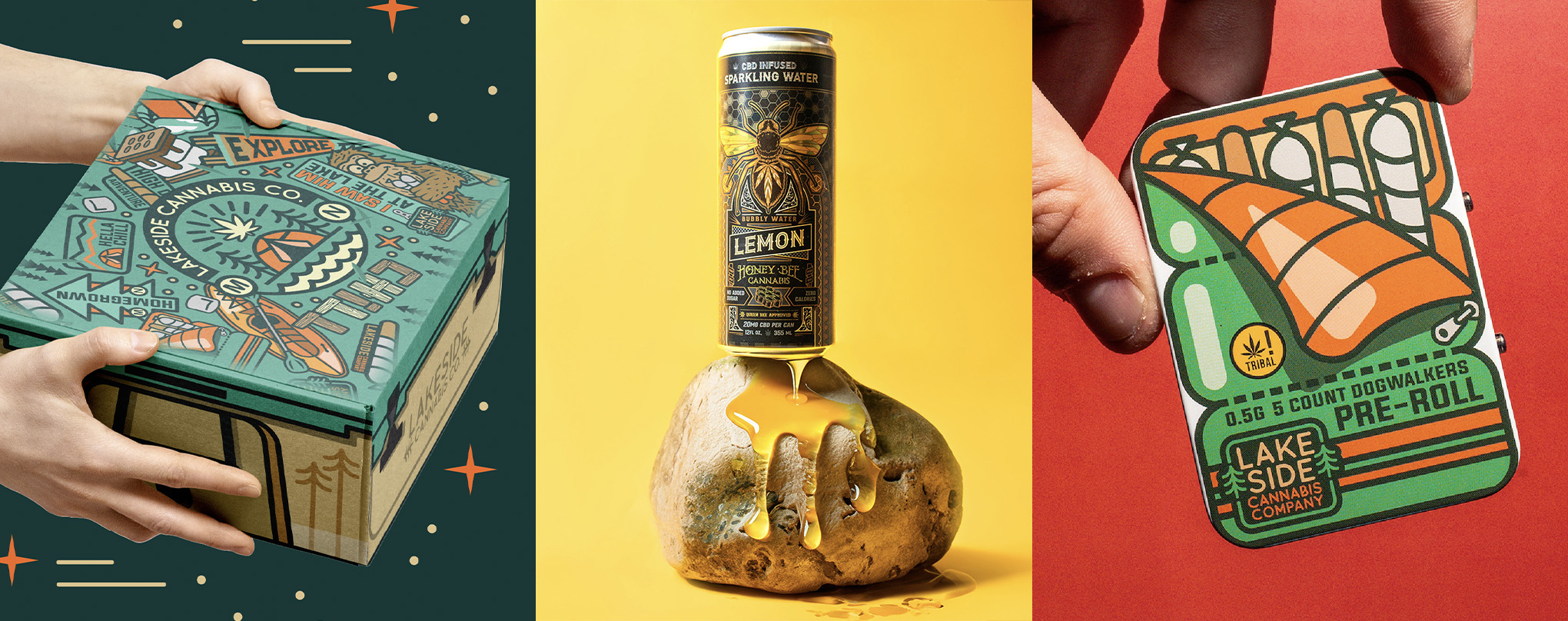
That’s something we’ve tried to lean heavily into with brands like Lakeside Cannabis Co.. Instead of creating isolated packaging pieces, we built an entire visual ecosystem around nostalgic camping culture and Midwest outdoors energy. The pre-rolls, blunts, flower, and disposables all feel connected to the same world. The packaging works together on shelves, online, and in someone’s hand while still giving each product its own personality.
We approached Nebula similarly, but from a completely different angle. That brand leaned into heavy illustration, space exploration, and weird flavor storytelling. The packaging wasn’t designed just to look trippy. It was designed to create curiosity and build a recognizable universe customers could instantly identify.
And with HoneyBee Cannabis, the focus became intentionality and cohesion across products and collaborations. The branding feels approachable, natural, and lifestyle-driven without falling into the overly sterile “wellness cannabis” aesthetic that so much of the industry started copying.
That’s the stuff people remember.
Not just isolated graphics.
The feeling around the brand itself.
Honestly, some of the best packaging decisions happen when brands stop trying so hard to look “correct.” A lot of businesses get nervous about standing out too much. They want to look premium because everybody else looks premium. They want to follow trends because trends feel safe. But usually the brands that build real followings are the ones willing to lean harder into personality instead of sanding all their edges off.
The funny thing is, consumers are actually really good at spotting authenticity. They can tell when a brand genuinely understands itself versus when it’s trying to imitate what’s already working for somebody else. That’s why great packaging usually resonates on a deeper level than just aesthetics. It feels connected to the people behind the brand. It feels ownable. Memorable. Human. And honestly, that matters now more than ever because everybody technically has access to the same tools.
AI can generate images.
Anybody can download templates.
Anybody can make something “look decent.”
But taste is still hard to fake.
Creative direction is still hard to fake.
Building something that actually sticks in people’s brains is still hard to fake.
That’s the part a lot of brands underestimate. At the end of the day, good packaging is not really about decoration. It’s about creating recognition and emotional connection. It’s about helping somebody instantly understand the vibe, personality, and energy behind a product before they ever even touch it.
Because in crowded industries, shelf impact matters.
Recognition matters.
Being remembered matters.
And the brands willing to take creative risks are usually the ones people come back to later.