Thank you! Your submission has been received!
Oops! Something went wrong while submitting the form.


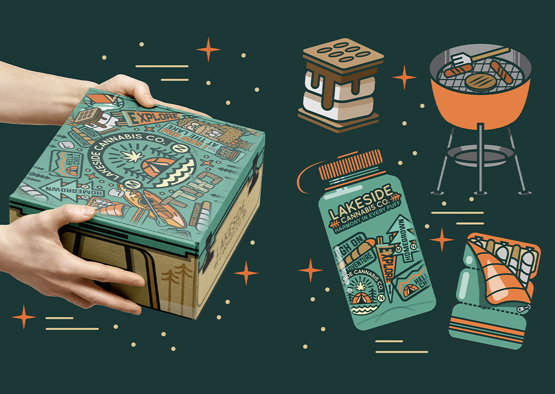
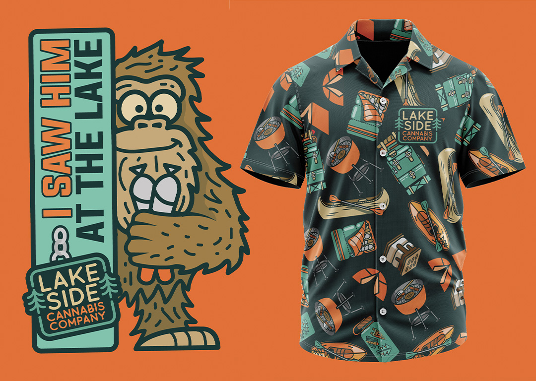
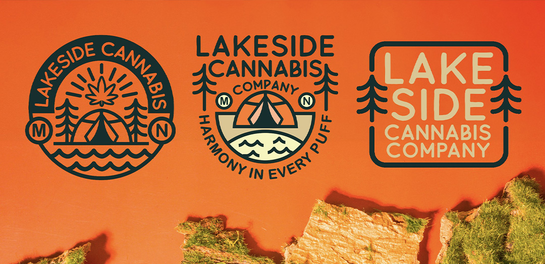
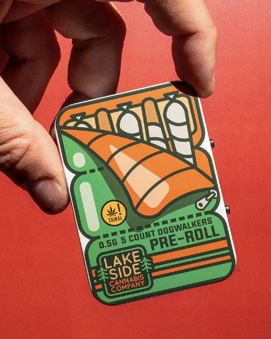
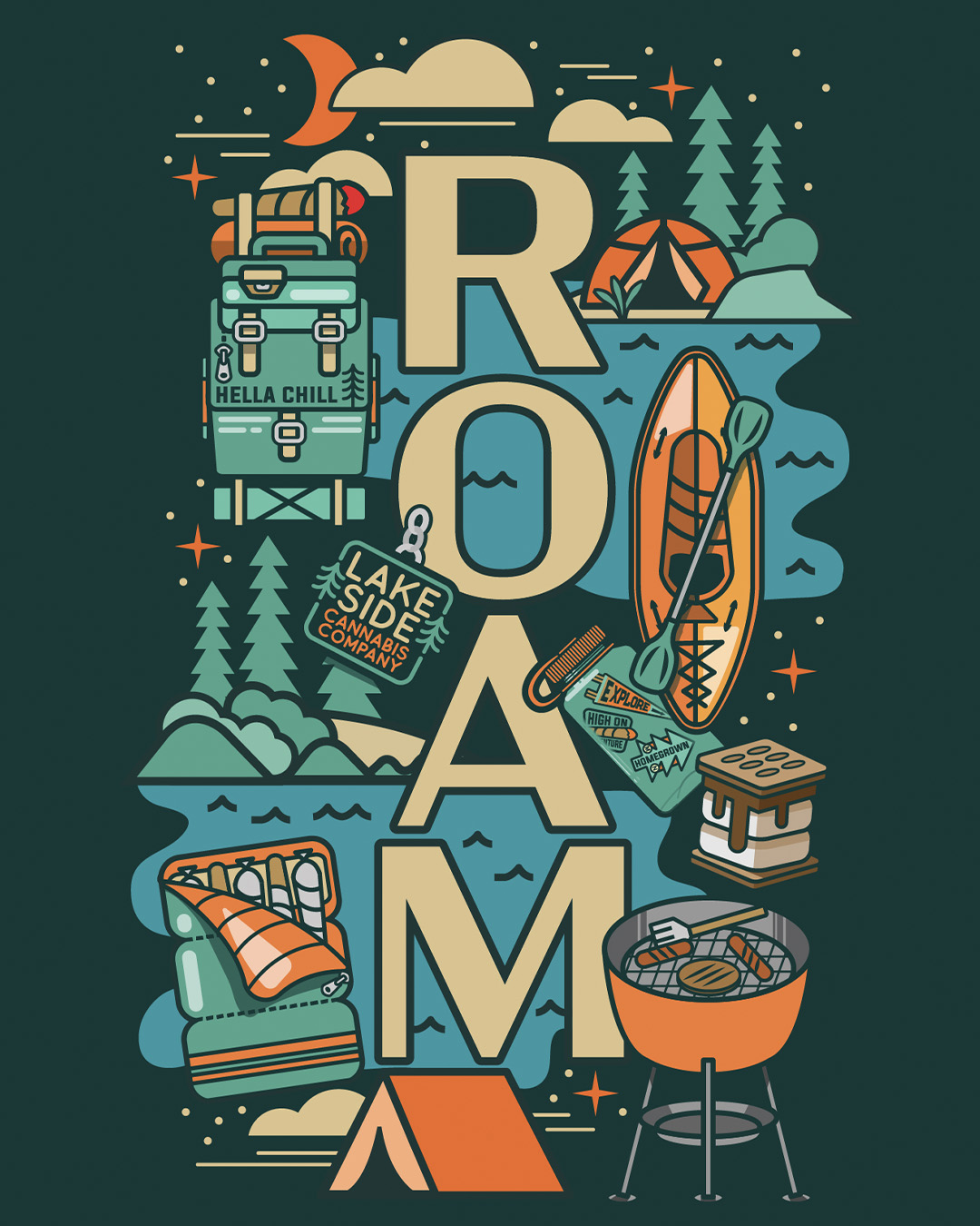
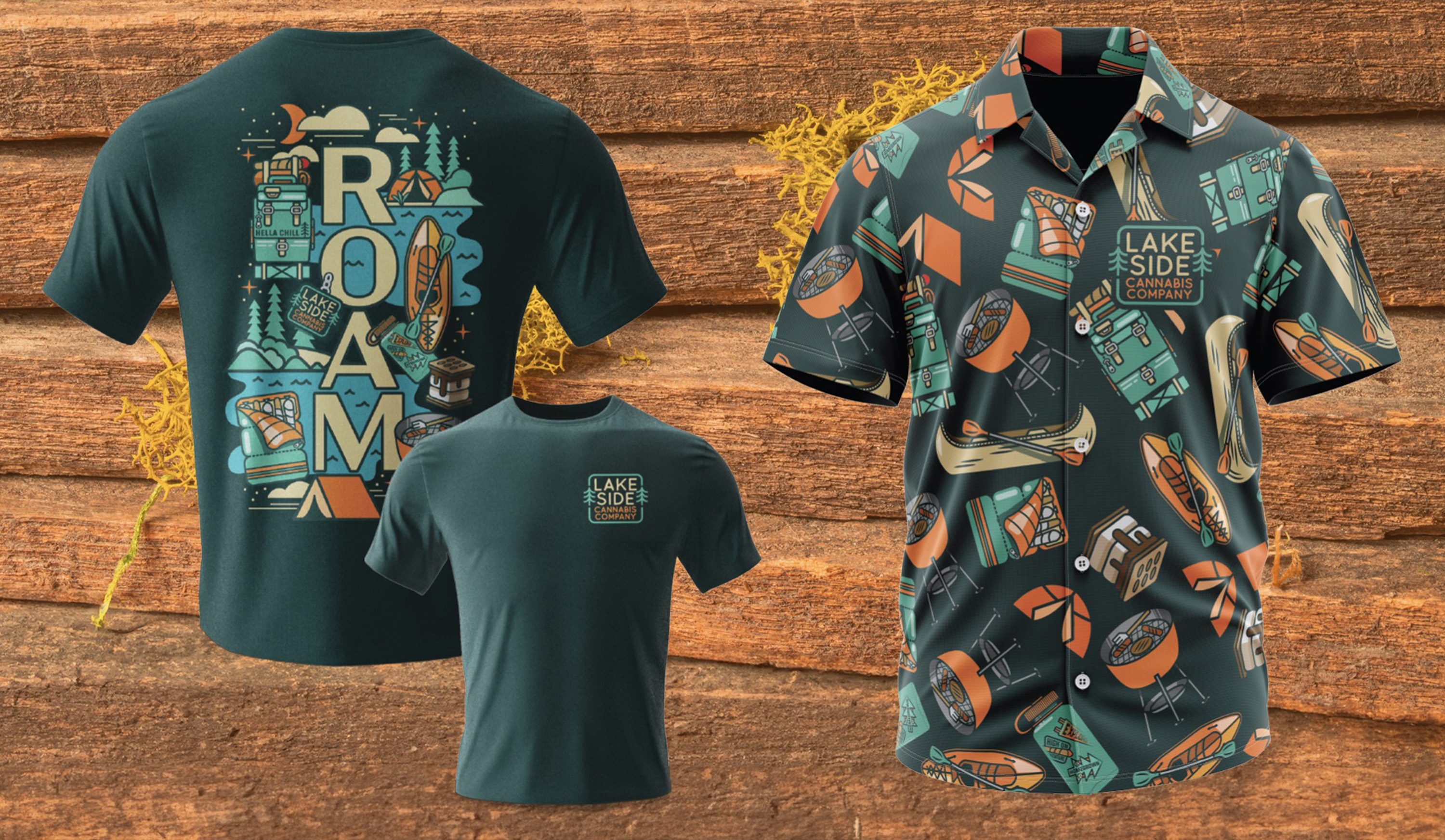
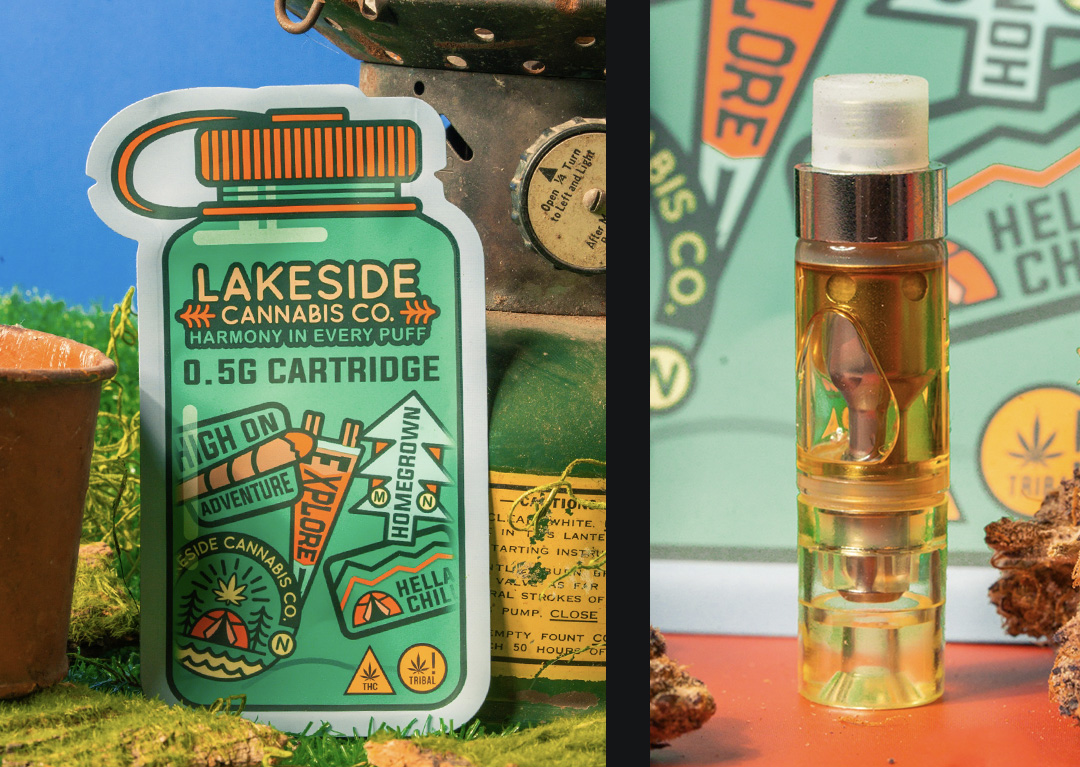
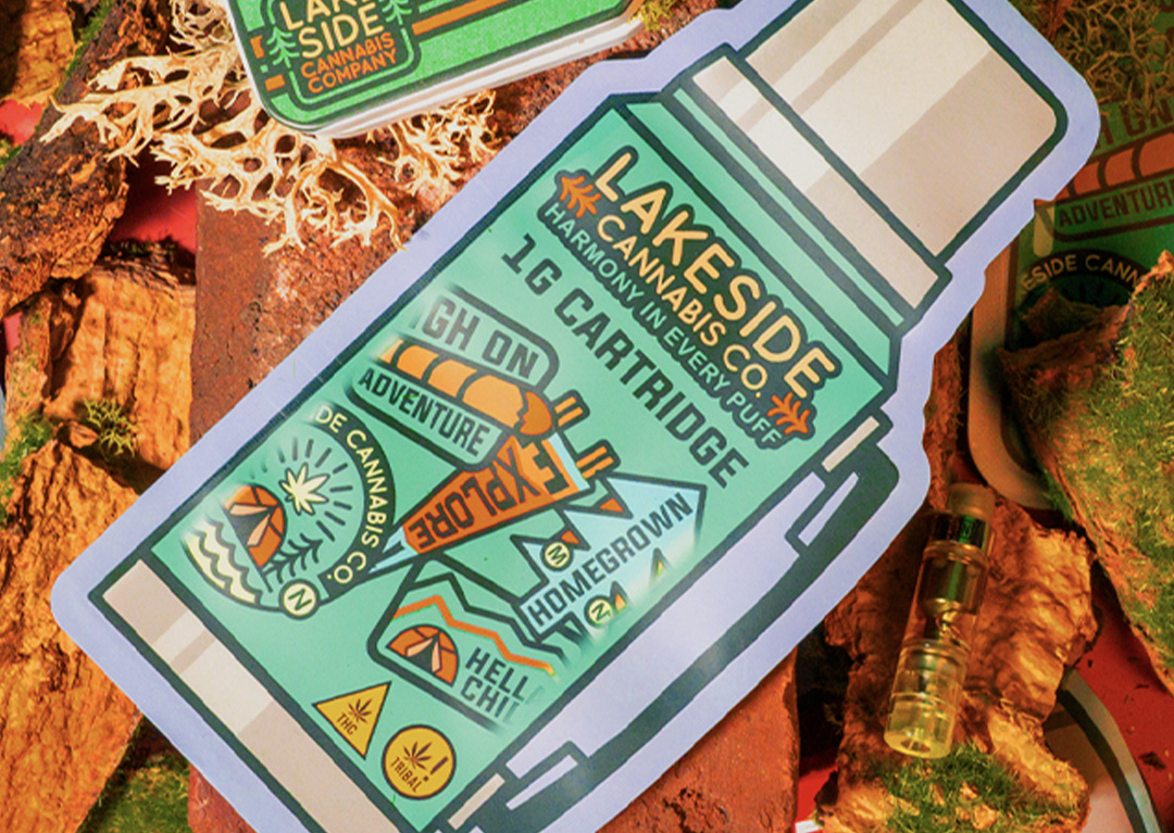
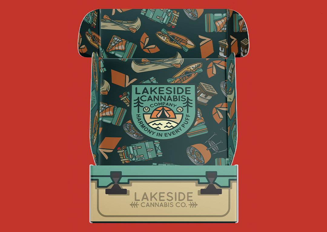
Lakeside leans into something a lot of cannabis brands avoid—personality. Instead of going minimal or overly premium, this direction pulls from classic camping culture and pushes it into something playful but still dialed in. Canoes, sleeping bags, backpacks, and trail-ready gear all become part of the visual language.The goal was to build a system that could stretch across a wide product line—pre-rolls, blunts, disposables, cartridges, flower, and more—without losing consistency.
Every package needed to feel like it belonged to the same trip, even as the formats and flavors changed.Illustration does the heavy lifting here. Each piece adds to the world, turning packaging into more than just a container—it becomes part of the experience.The end result is a brand that feels approachable, memorable, and actually fun to engage with. Not following trends, not overcomplicating things—just a clear idea, executed well, and built to grow with the line.