Thank you! Your submission has been received!
Oops! Something went wrong while submitting the form.

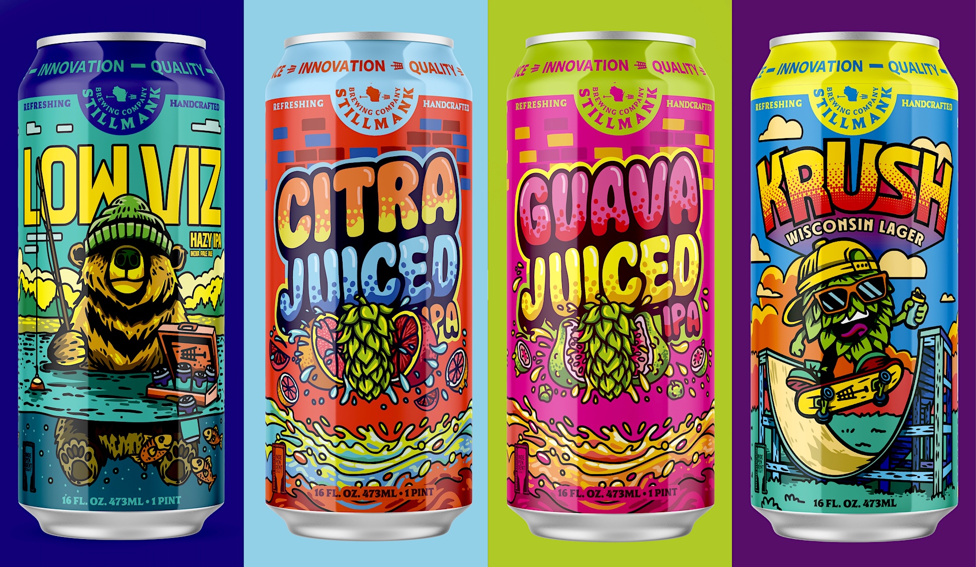
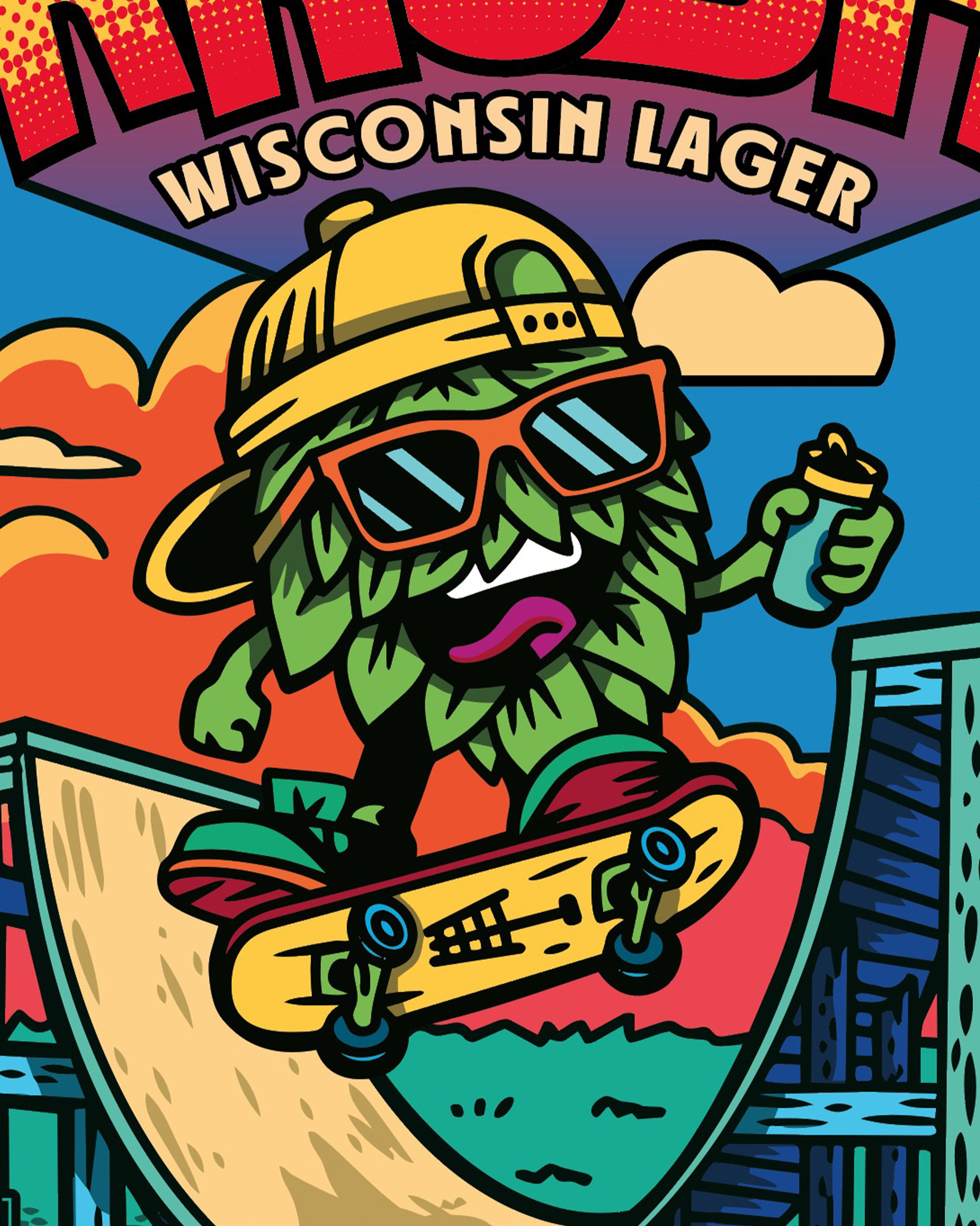
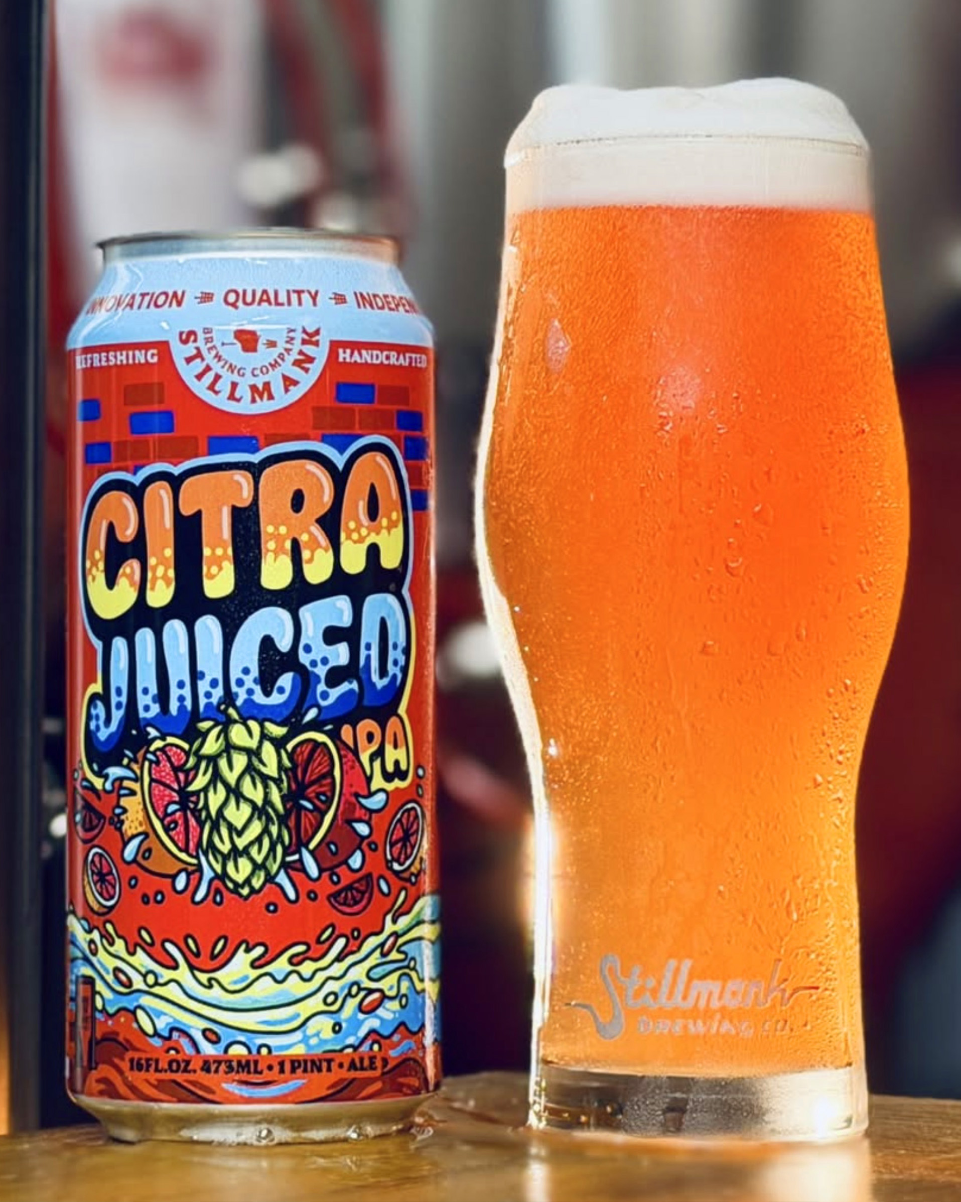
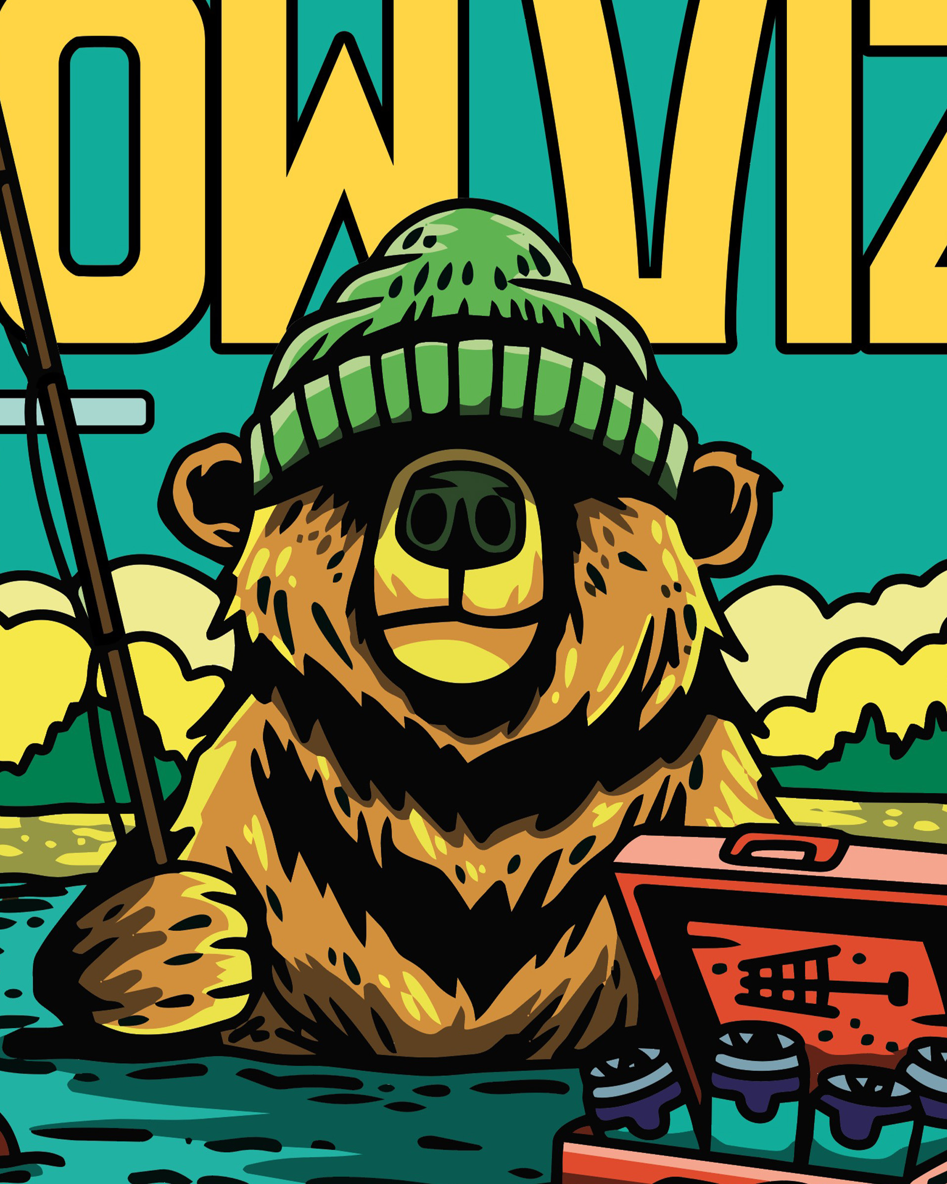
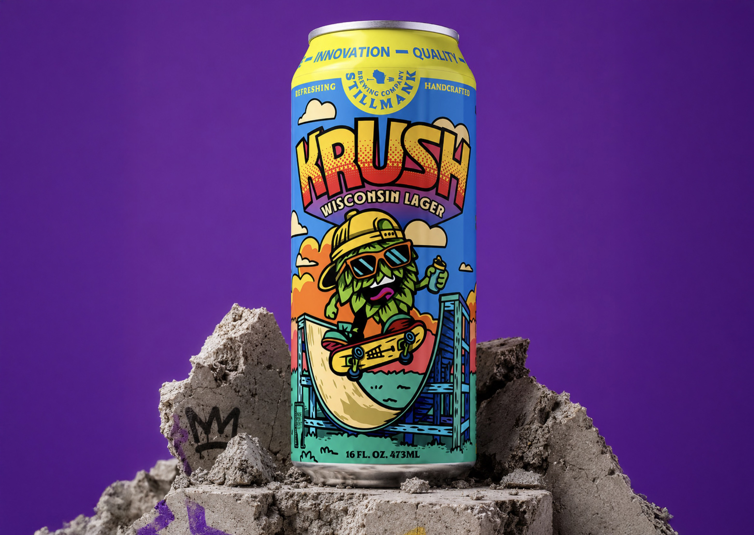
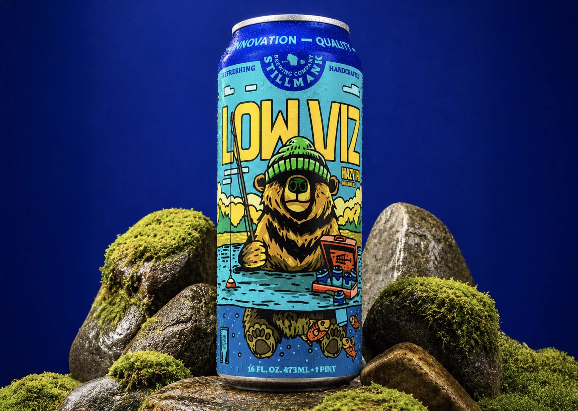
Stillmank came to us looking for a fresh take on the lineup without losing what made the brewery feel like itself. The goal was building a can system that feels connected on the shelf while still giving every beer its own identity and personality.
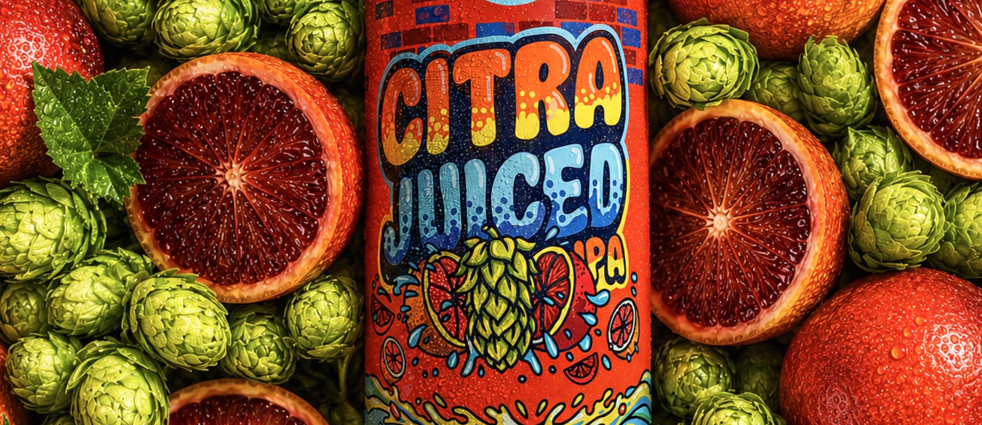
We first connected with the Stillmank crew at a beer convention, and the challenge was pretty clear right away. The beers were solid, but the lineup needed more consistency and shelf presence. Things had to start feeling connected without turning every can into the exact same thing with a different color slapped on it.The approach was building a flexible system. Strong enough that people start recognizing a Stillmank beer from across the aisle, but open enough that each release still gets to have its own moment. Different styles, different flavors, different energy. Everything needed room to breathe while still feeling part of the same family.We refined typography, layout structure, color direction, and overall hierarchy so the cans work better together as a lineup while still standing strong individually. Some beers lean louder, some lean cleaner, but they all speak the same visual language now.End result is a product line that feels more recognizable, more dialed in, and easier to build on moving forward. A system built for growth without losing personality along the way.