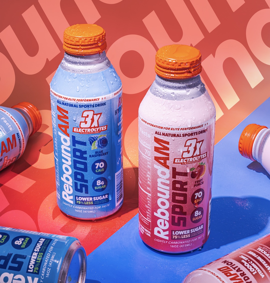
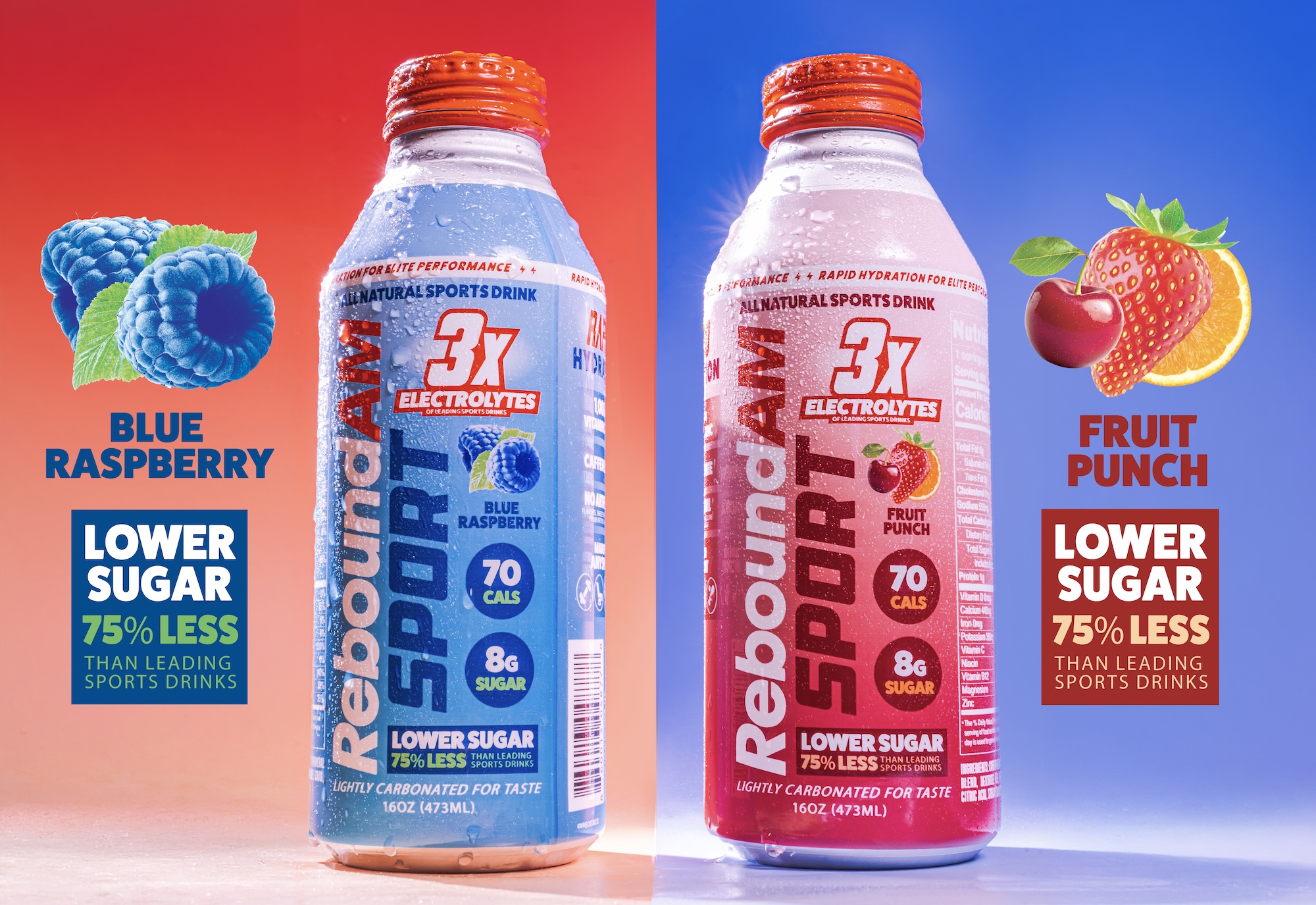
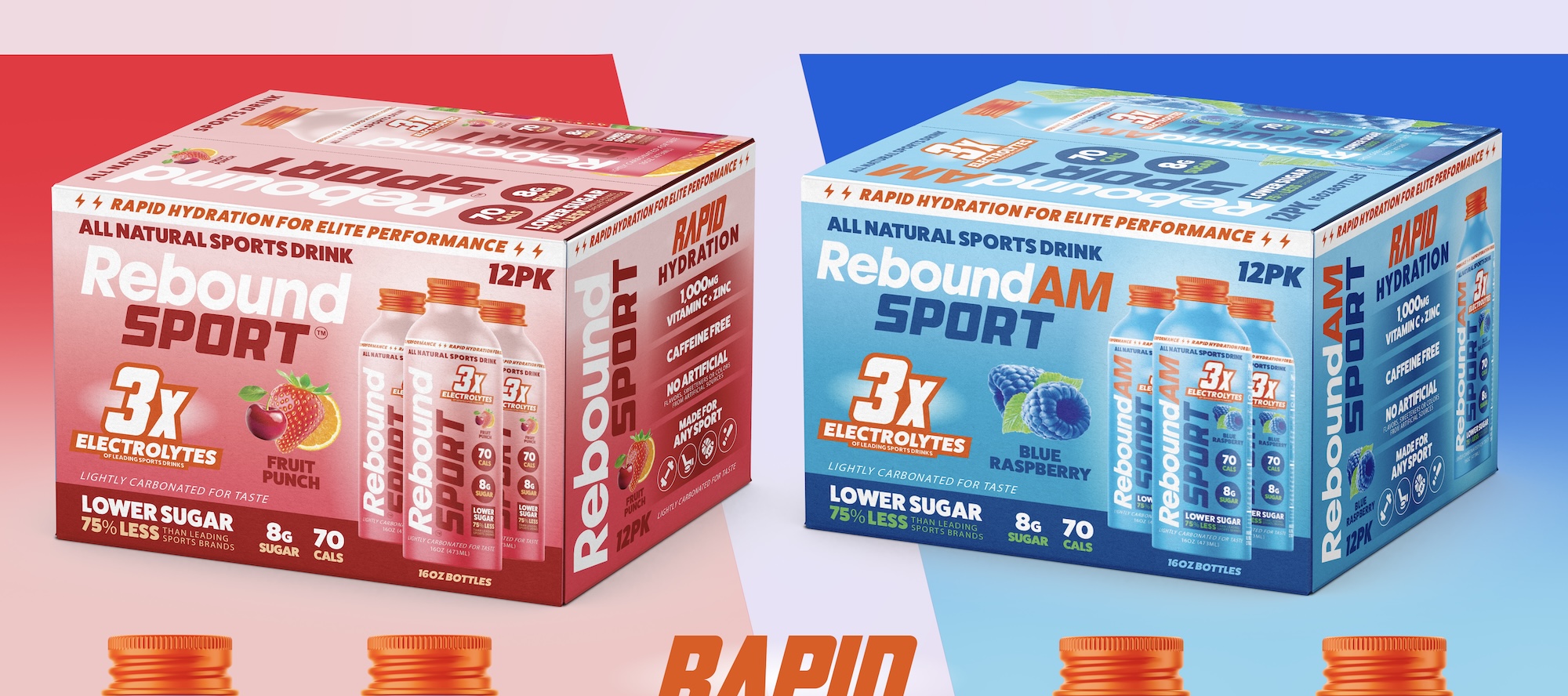
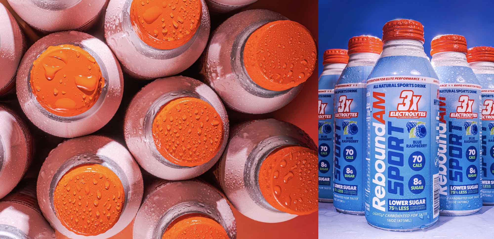

Sports drinks aren't exactly known for playing it subtle, and ReBoundAM wasn't about to start. For their SPORT lineup, the goal was to create something bright, bold, and packed with enough personality to hold its own on the shelf.
ReBoundAM has a pretty straightforward mission: help people stay hydrated and keep moving. With their SPORT lineup, we wanted to give the drinks a look that felt just as energetic as the people reaching for them.
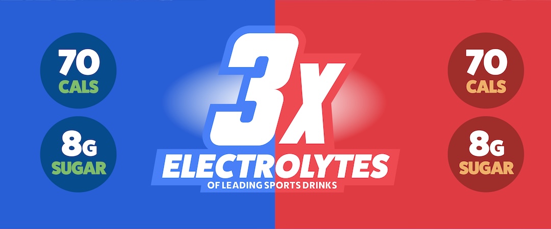
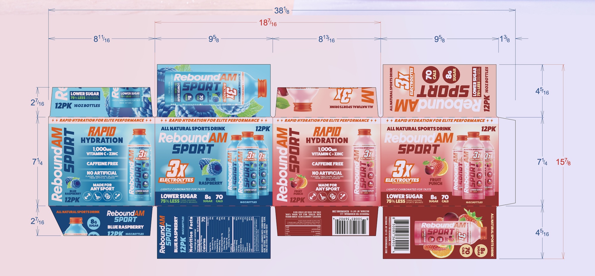
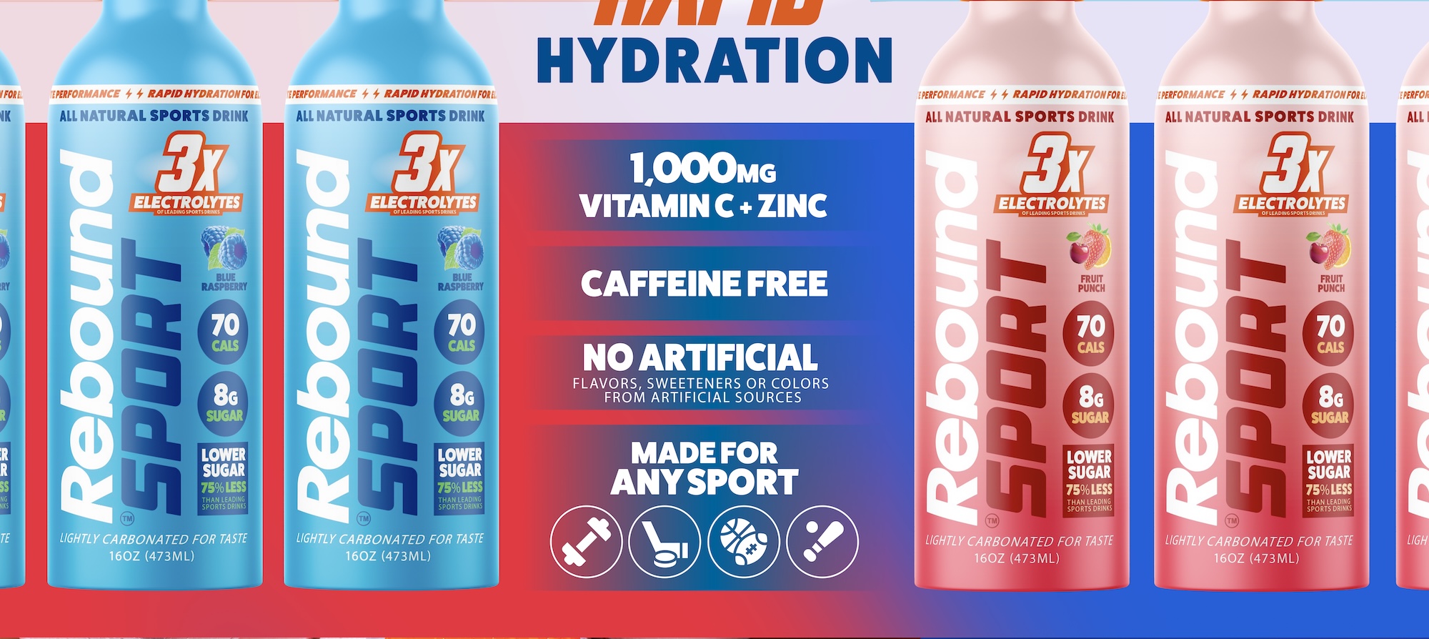
The designs lean into oversized typography, bright colors, and some fun flavor details to give each drink its own personality while keeping the lineup consistent. We also made sure the important stuff, like electrolytes and nutritional callouts, was easy to find without turning the label into a science project. Nothing overly complicated. Just a solid packaging system that looks great together, makes sense at a glance, and gives ReBoundAM a little extra swagger on the shelf.