Thank you! Your submission has been received!
Oops! Something went wrong while submitting the form.

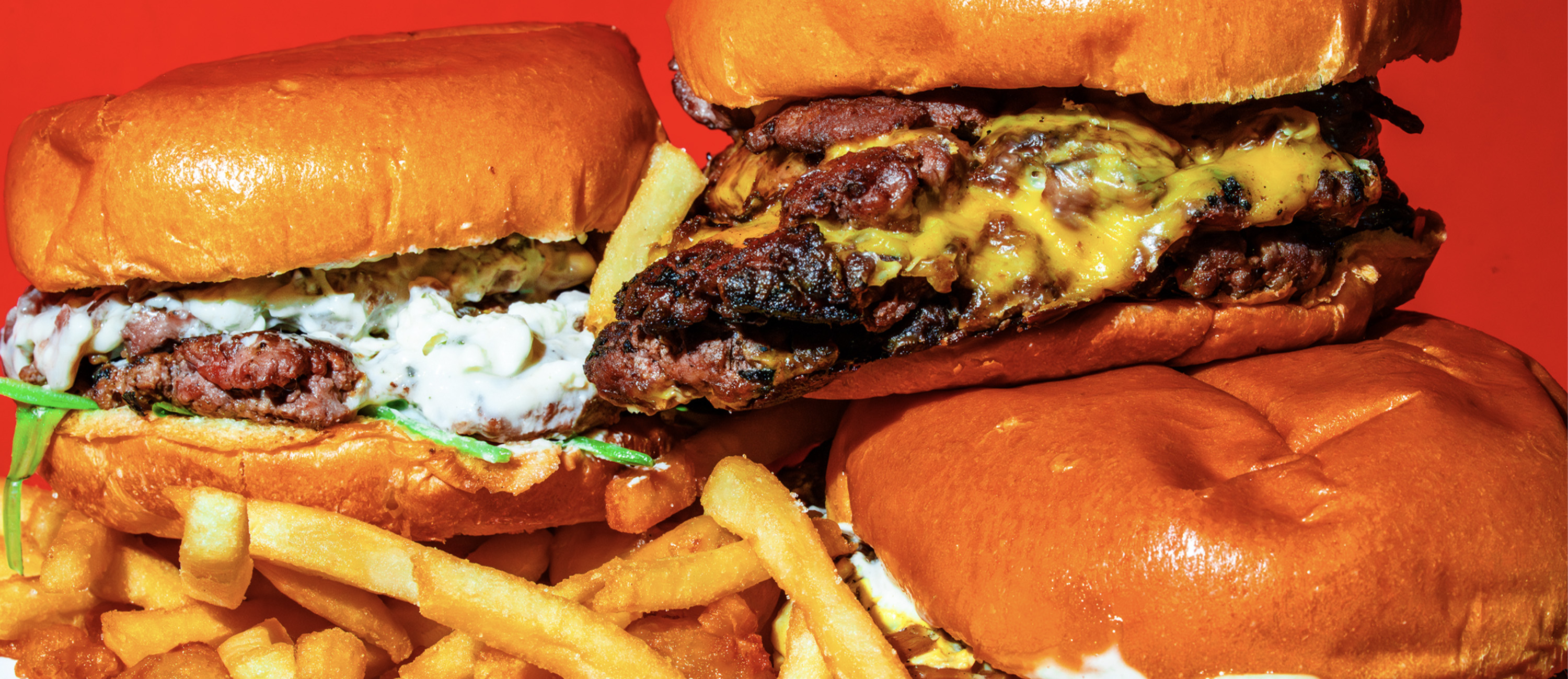
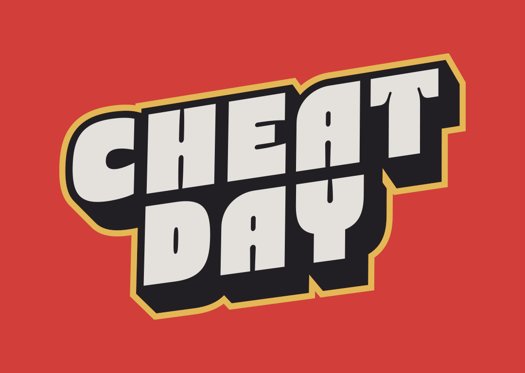
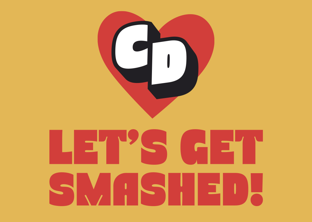
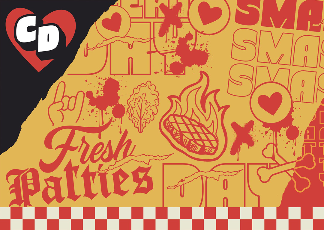
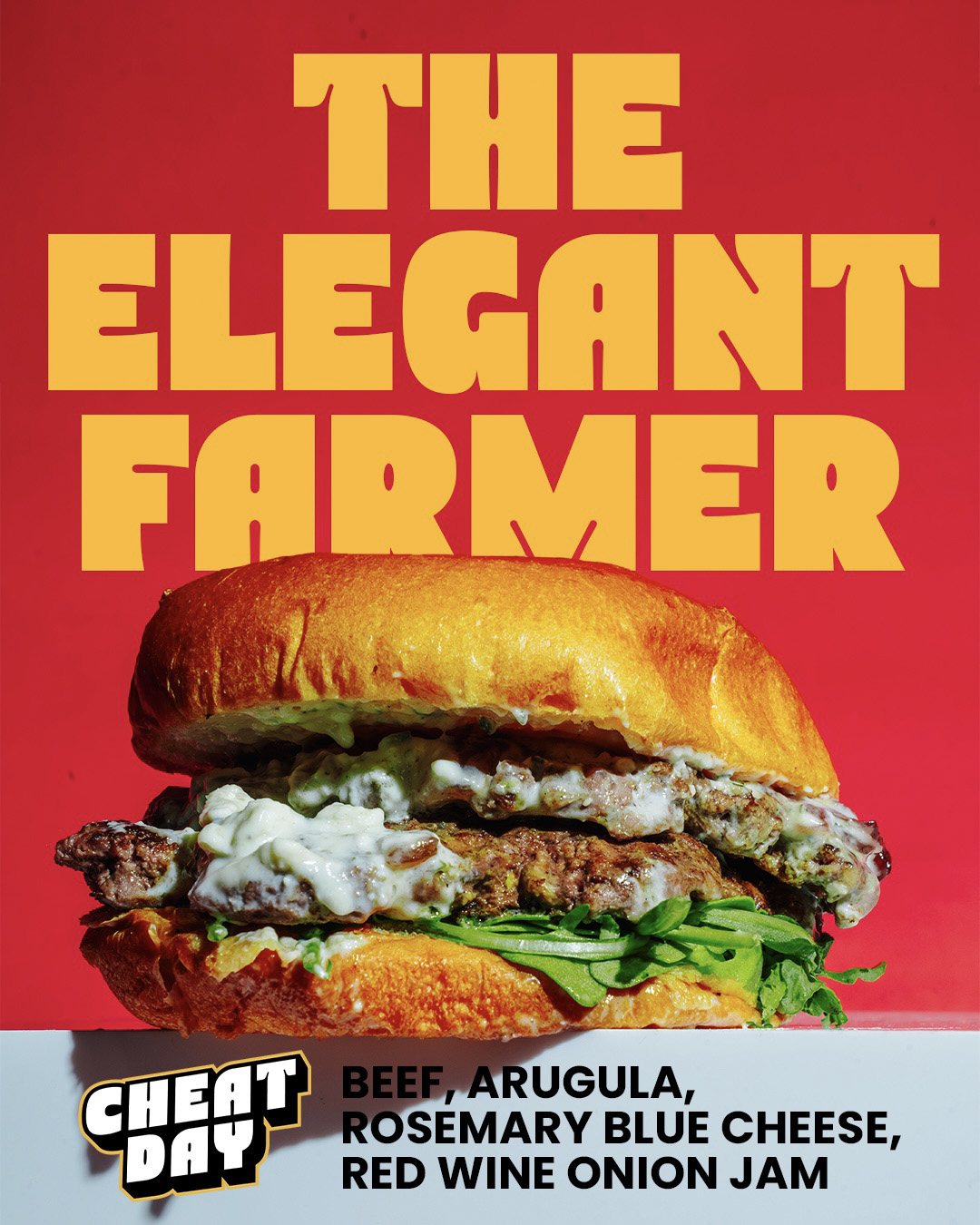
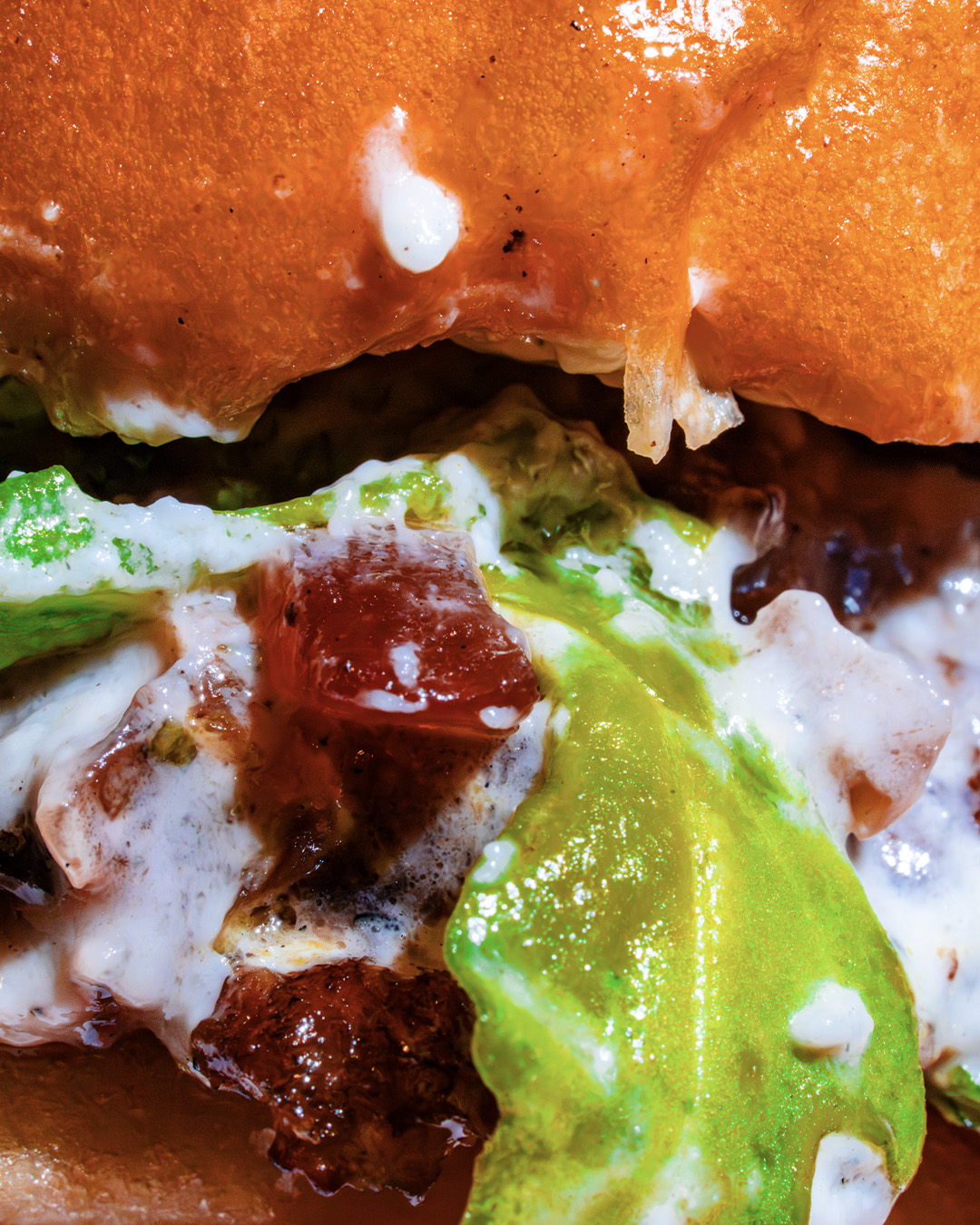
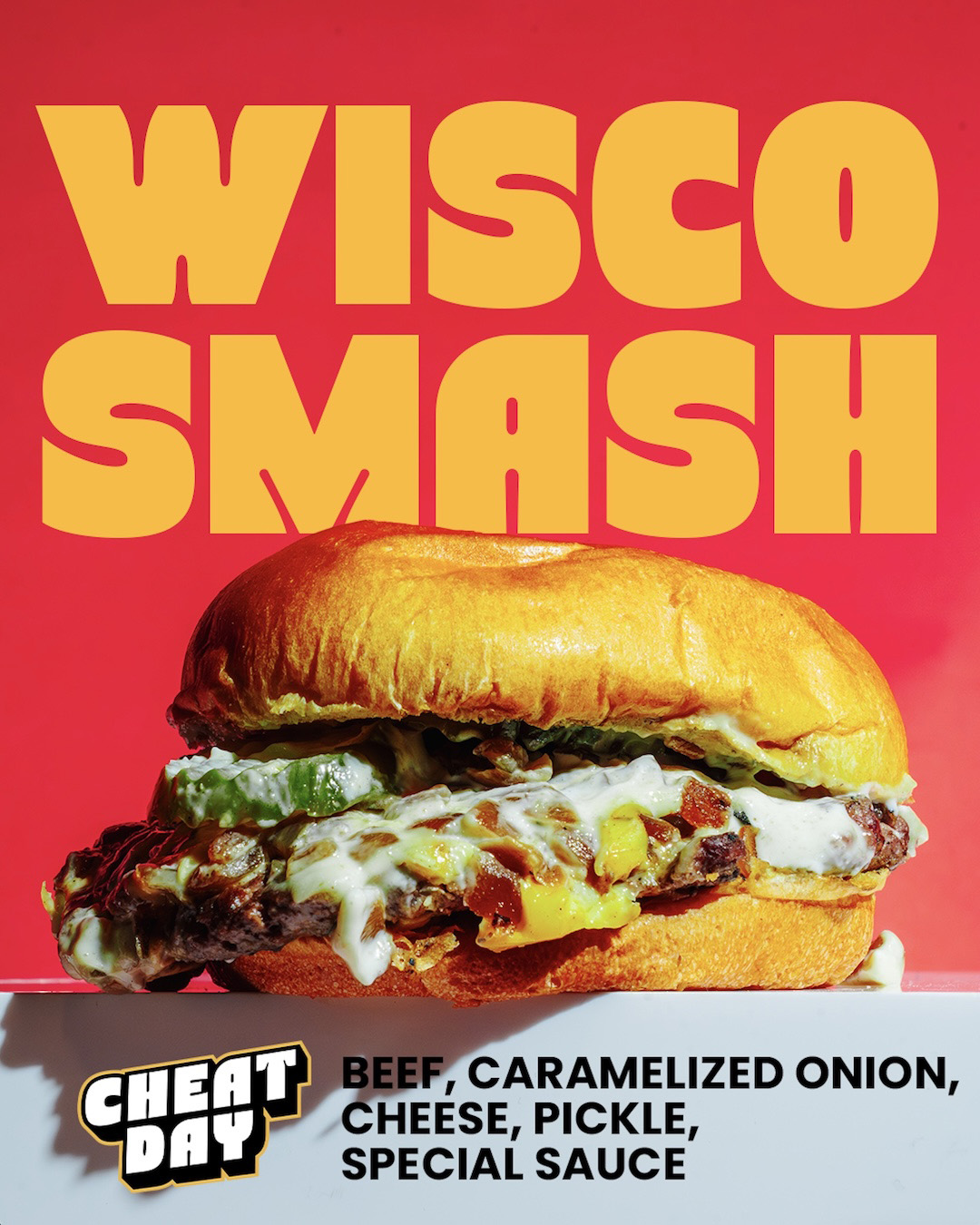
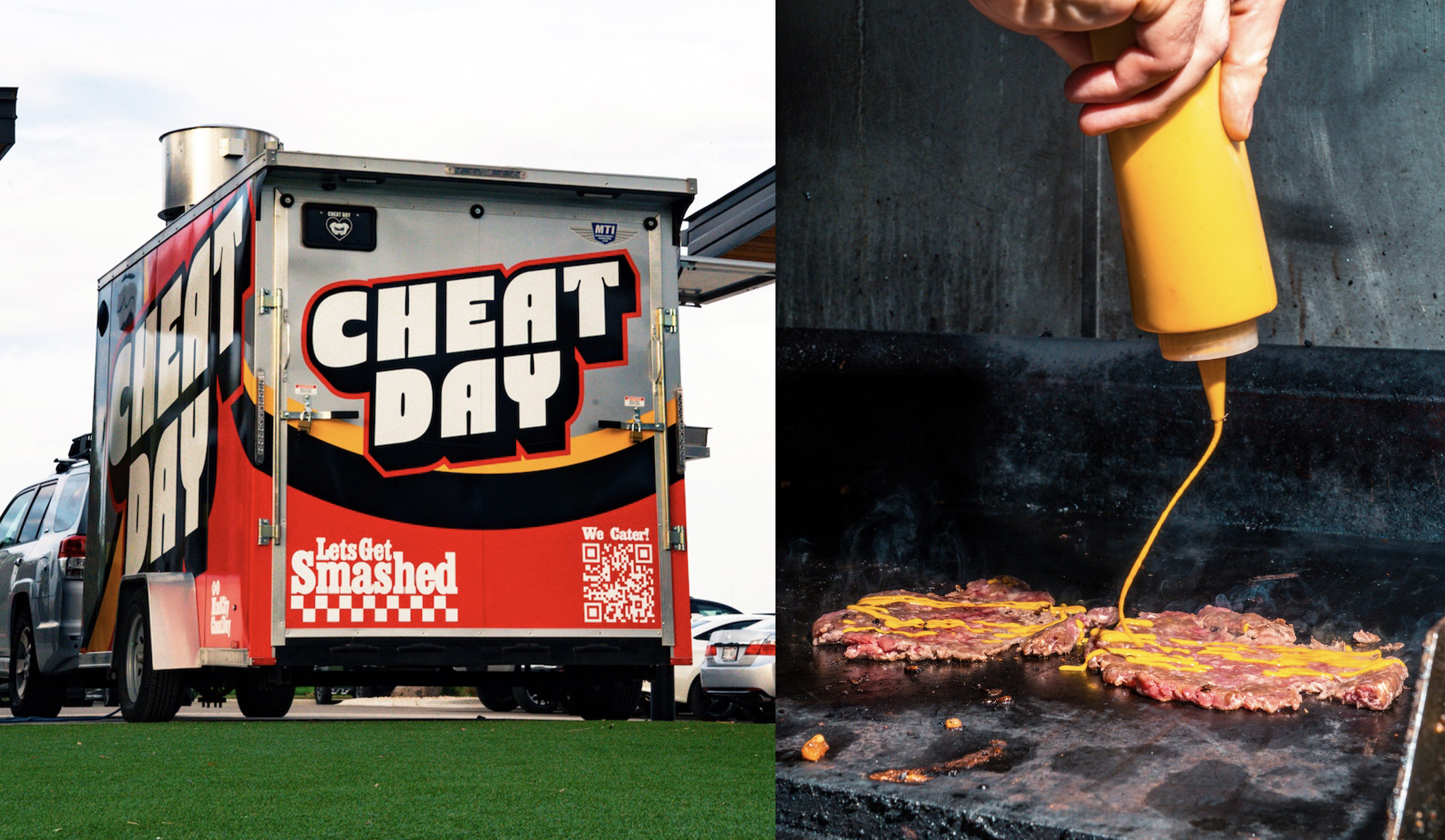
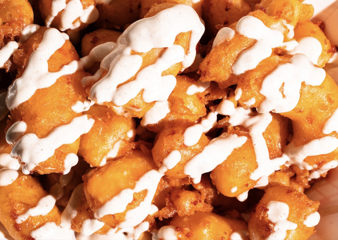
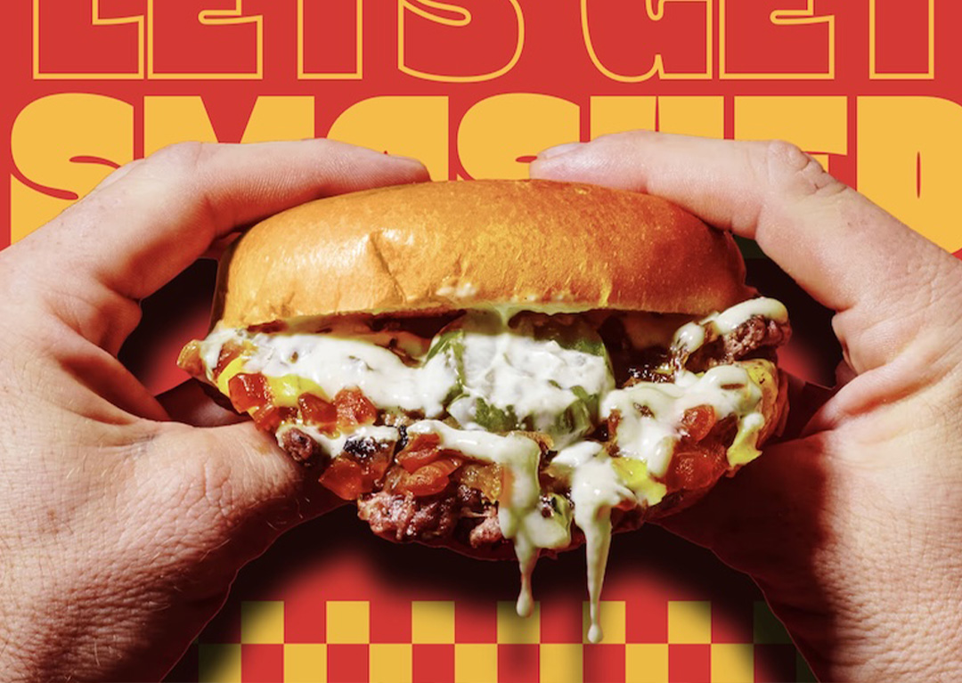
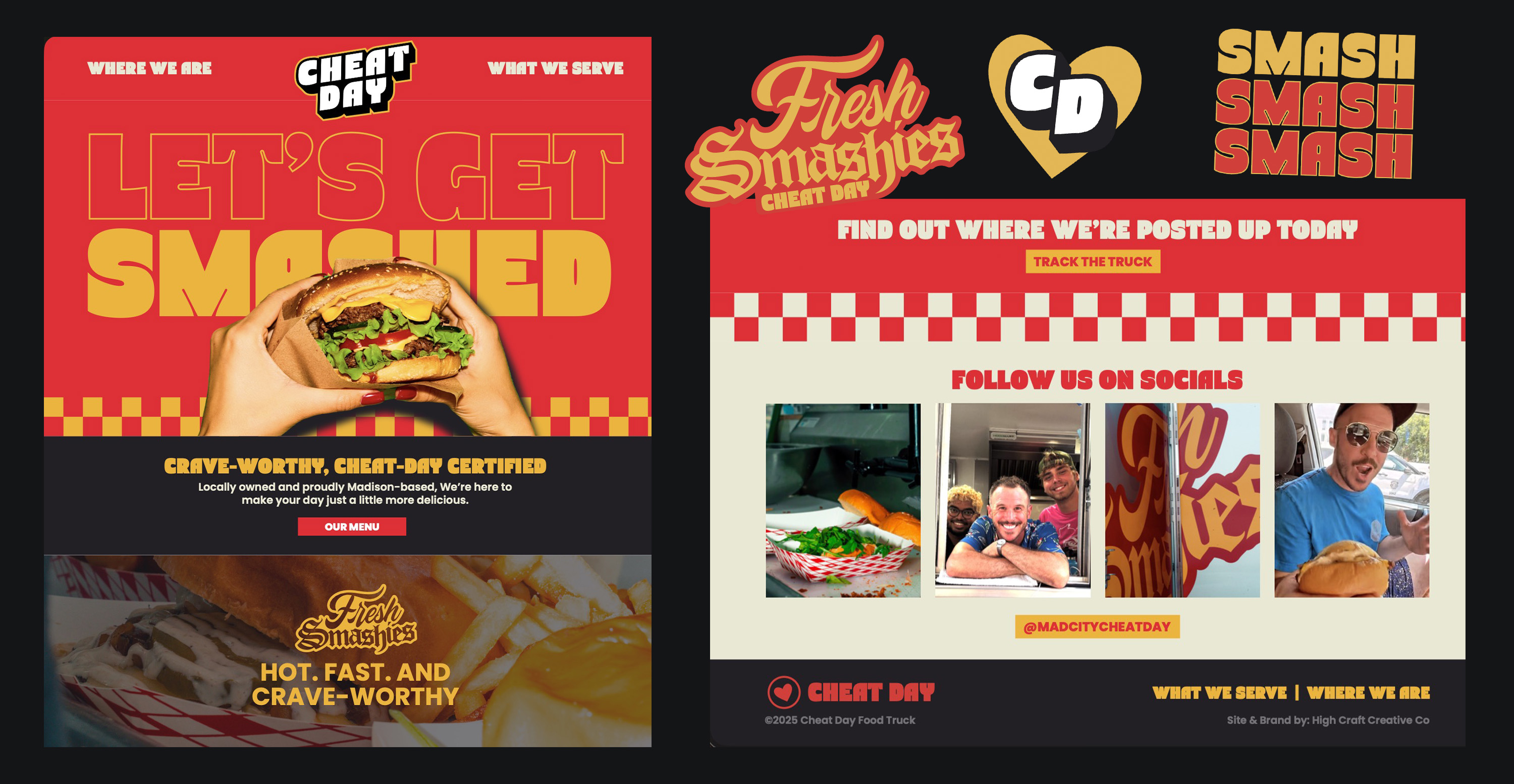
This was a full ground-up build. Logo, brand direction, art direction, photography, and website all built around one idea. Make it feel as bold and unapologetic as the food. No clean, minimal burger branding here. This pulls from fast food nostalgia and pushes it into something louder, grittier, and more self-aware using a red, yellow, and black palette that hits hard.The voice does a lot of the heavy lifting. Lines like “Your Diet Hates Us” and “Let’s Get Smashed” are not just taglines. They shape how the brand talks, how it shows up, and how people remember it. It is meant to feel fun, a little aggressive, and real enough to stick.Photography brings it home. Smash burgers are messy, and that is the whole point. Melted cheese, dripping sauce, stacked layers. Shot up close with bold lighting so everything feels big, heavy, and craveable.The website ties it all together. High energy, easy to use, and built to match the same attitude as the truck. From the menu to tracking where it is parked next, everything feels connected.End result is a brand that does not try to be perfect. It just makes you hungry and makes it hard to say no.